Smart Ads (AI-powered Ads Builder)
Empowering small and medium sized marketers to create content faster and more confidently.
Role: Product Growth Designer
Responsibilities: Define user problem, support business with category creation, build and test new tools to accelerate growth.
Tools used: Figma, Pre-totyping, Hotjar, Google Analytics, Tableau
Business Goals
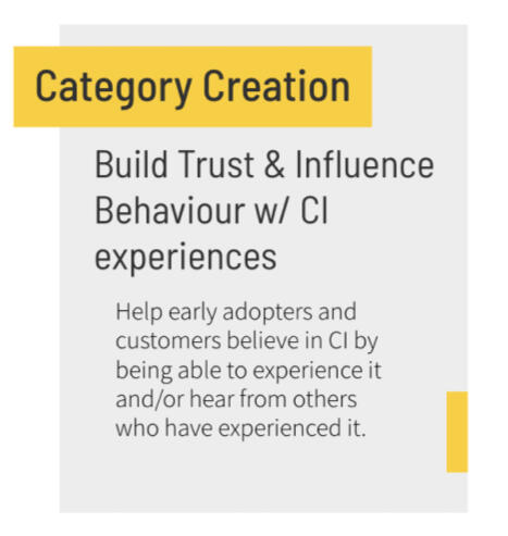
• Empower Small + Medium Businesses with Conversion Intelligence tools
• Build search volume for new category - “Conversion Intelligence (CI)”
Problem Context (Reseach Survey)
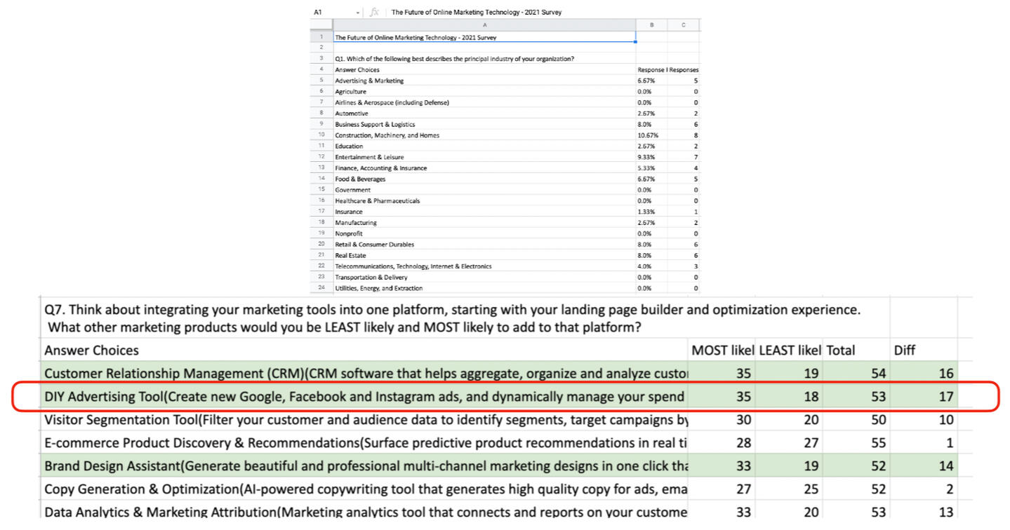
Together with the Product Marketing team, we ran a survey to learn what other solutions Unbounce customers using our landing page builder might want, in order to serve their evolving business needs.
We learned that Small and medium-sized businesses were seeing a rise in Pay-Per-Click (PPC) dollars during the pandemic, along with tighter budgets for resourcing and being strapped for time. They were looking for a DIY ad solution that would generate pay-per-click ads as well as manage their ad spend dynamically.
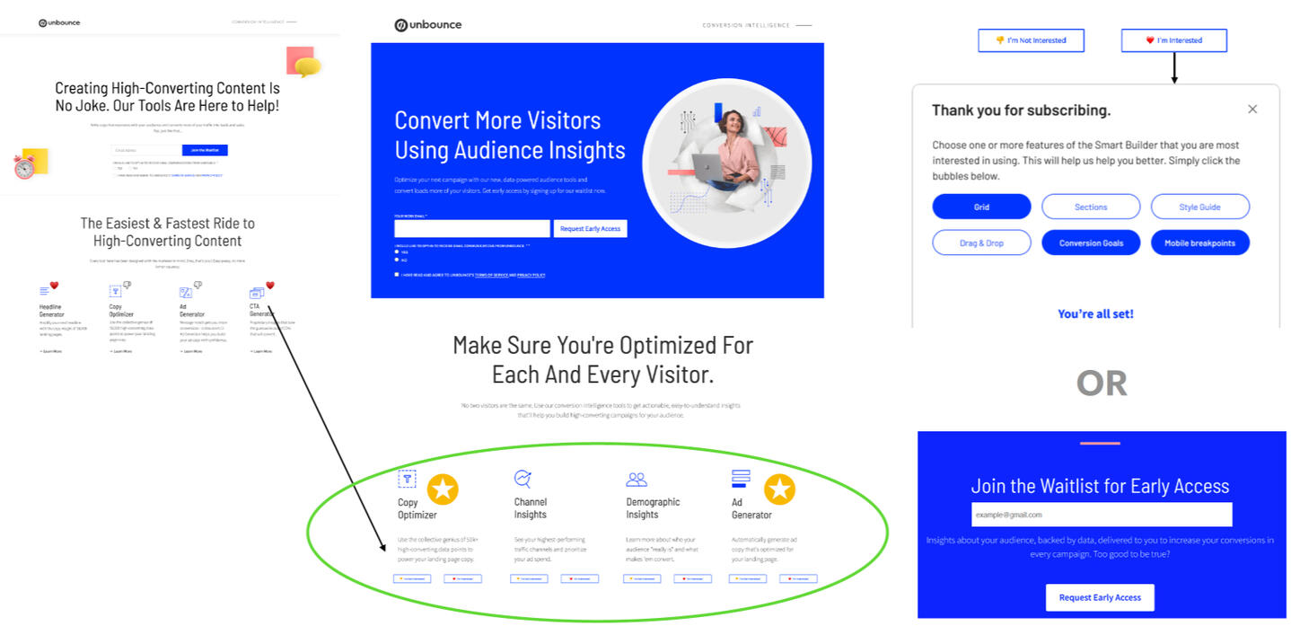
Pre-totype (Discovery)
A pre-totype is a stripped-down version of a product, used to merely validate interest. I built a pre-totype page with Unbounce's landing page builder. Taking inspiration from companies like IKEA, I used this method to inform the WHY for our next project.We added 4 value props along with an Interested/Not Interested button, similar to a swipe-left swipe-right interest system, to see what people were leaning towards. When they clicked on ‘Interested’, we’d show a thank you for subscribing pop-up where they can provide more specific feedback on which features of that tool they’re most interested in. Alternatively, they could also waitlist for early access to a tool giving us a signal for how many people we were going to build our solution for, before actually building.The winner was Ad Generator with close runner-up being Copy Optimizer.
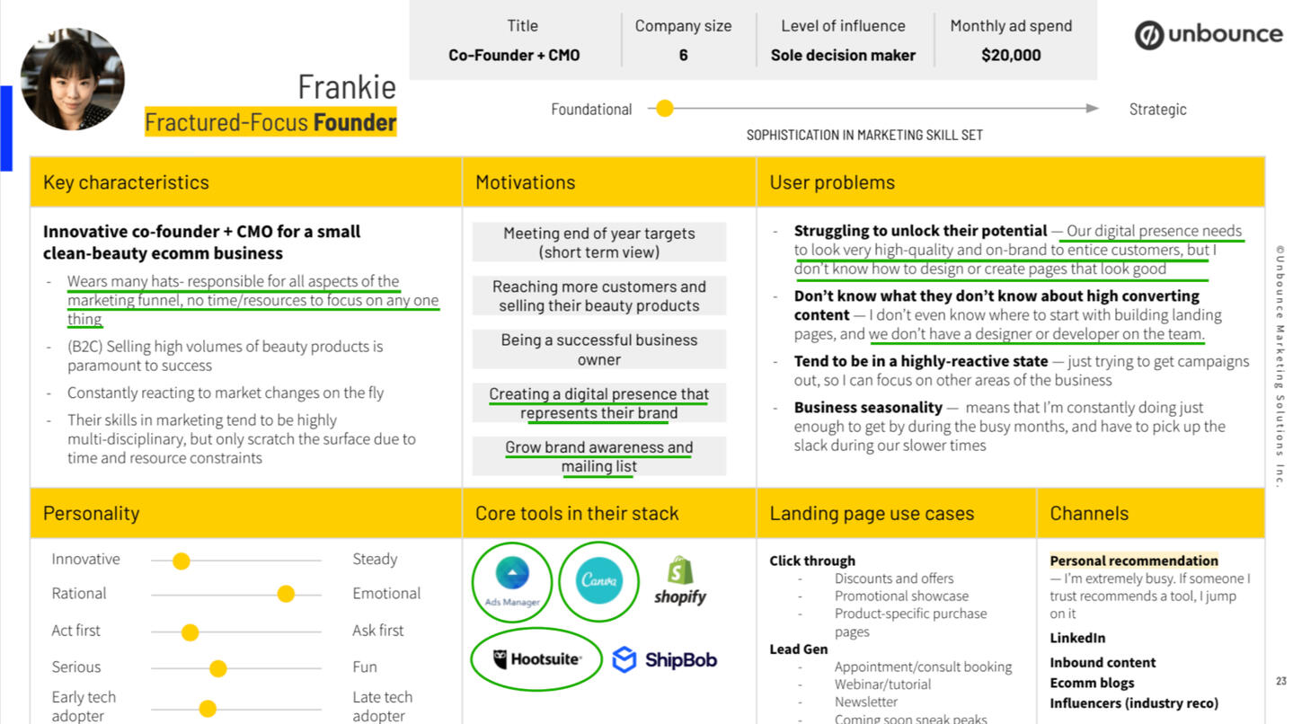
Persona (from existing user archetypes)
Frankie's primary motivations and problems are highlighted with a green underline.
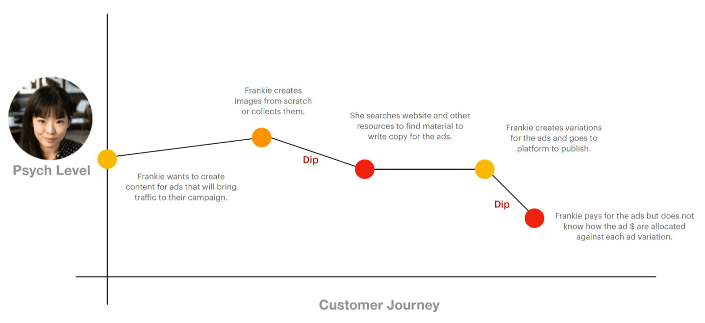
Visualizing Frankie's current journey
Red's signify frustration or major pain points in her journey and oranges are 'could be better' moments
Arriving at a Problem Statement
How might we augment users’ marketing know-how, with AI-backed data so that users can create high-converting ads?
Forming a hypothesis with PM
SMB (Small & Medium business) marketers are seeking the ability to generate smarter ads that will save them time, money and improve their conversion rates at the same time.
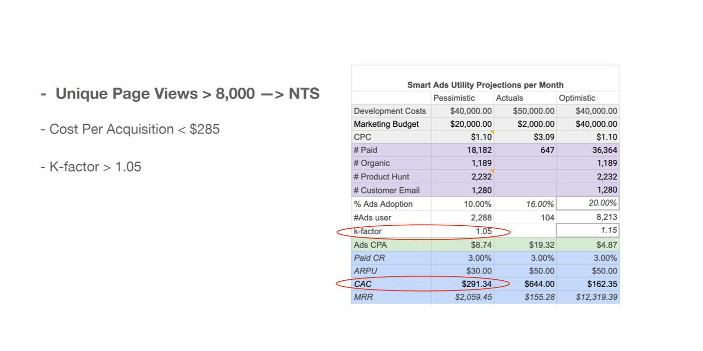
Defining success metrics
Wireframes
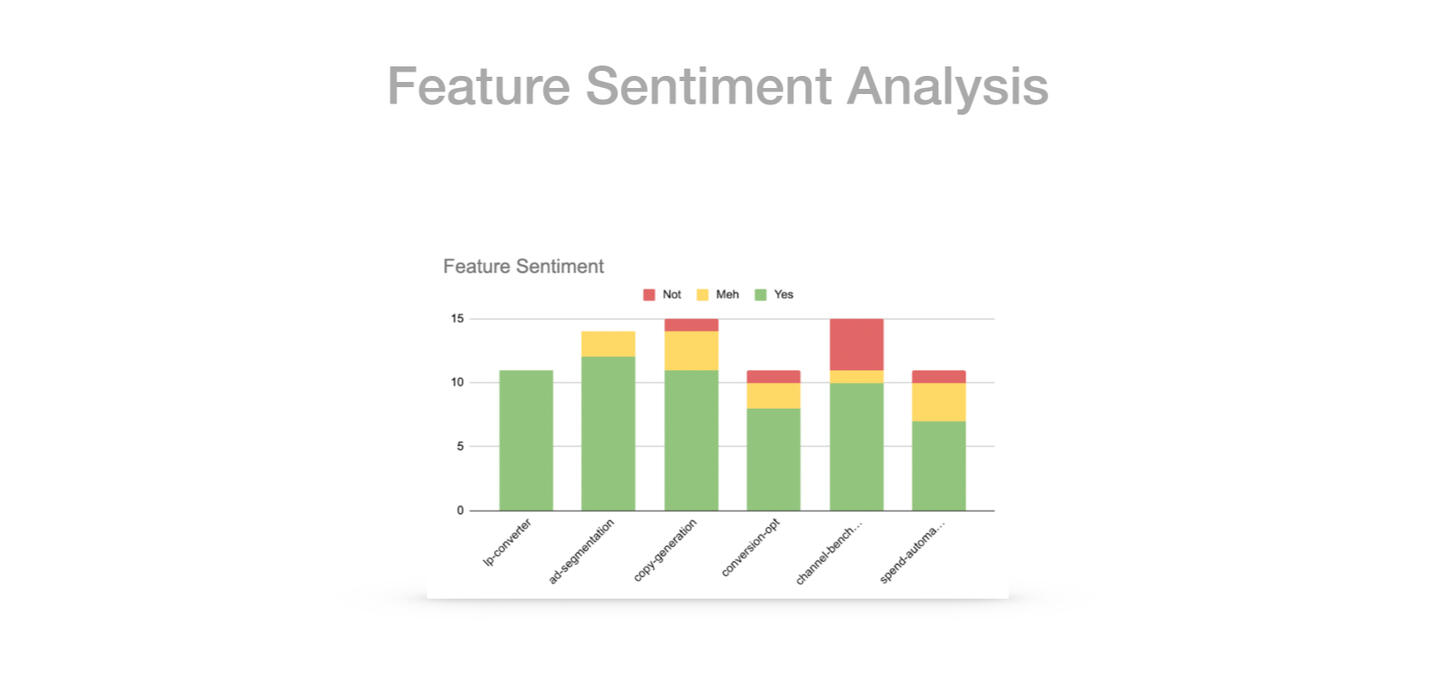
Post-experiment analysis
The data from sentiment analysis informed that people were the most interested in Ad-segmentation feature as well as landing page converter feature. This went on to inform the design and strategy for our next tool.
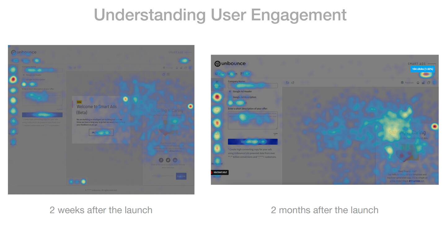
• The heat maps below informed that most user engagement was with templates and AI-generated copy feature, which helped me optimize the experience of those two, further.
• The downloads (on the top right corner) had increased significantly in 2 months after launch, which was a good signal that people were using the tool for building ads.
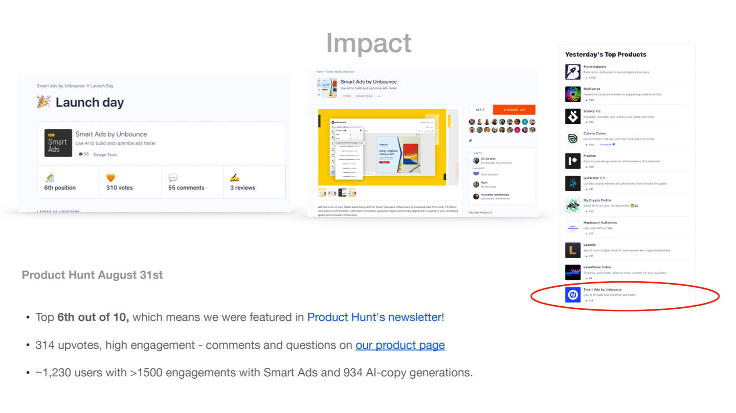
We won an award for being the most innovative tool, on Product Hunt and got featured in their newsletter too!
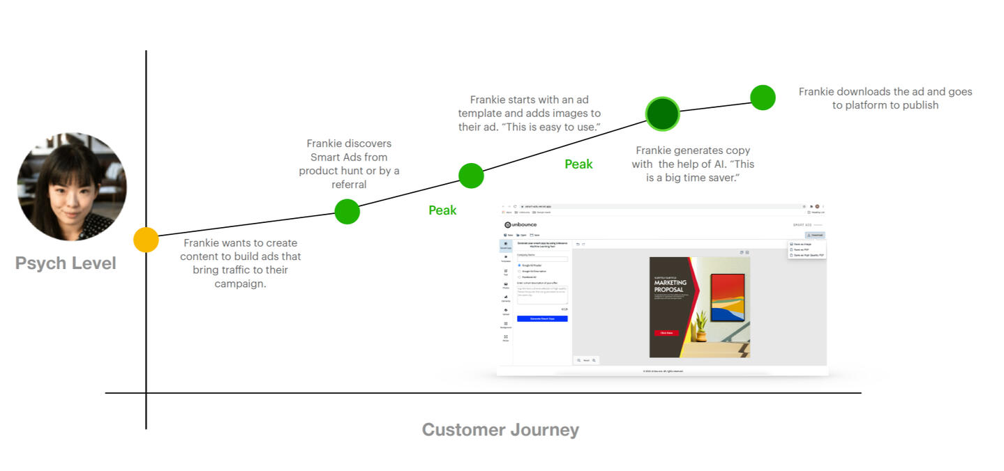
Visualizing Frankie's Improved Journey
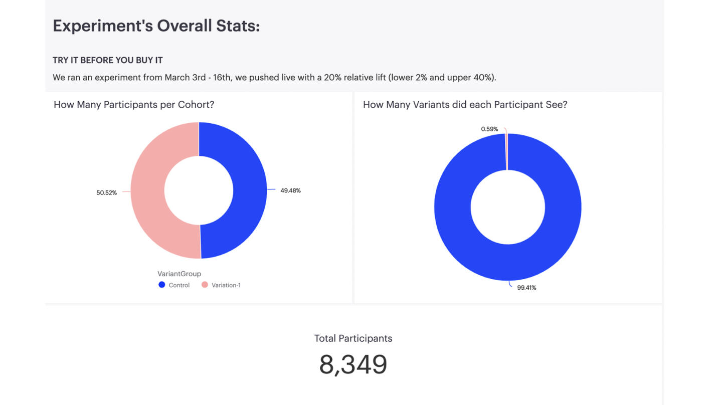
Try Before You Buy (Growth Hack)
Amazon Prime, Netflix, Warby Parker and many more companies offer a preview of their product before asking users to commit to even a trial plan. This is a growth experiment that allows people to fully interact with the product before signing up for a free trial or purchasing a plan.
• Role: Product Growth Designer
• Responsibilities: Define problem, break down goals into a delightful user experience, measure impact.
• Tools used: Figma, Hotjar, VWO, Mode Reporting
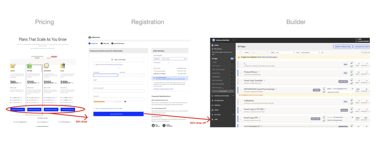
Problem context
• 33% of visitors would drop off at the pricing stage without getting to registration.
• Additionally, 64% of visitors who went up to Registration, would drop off before getting to interact with the Builder (product) itself.
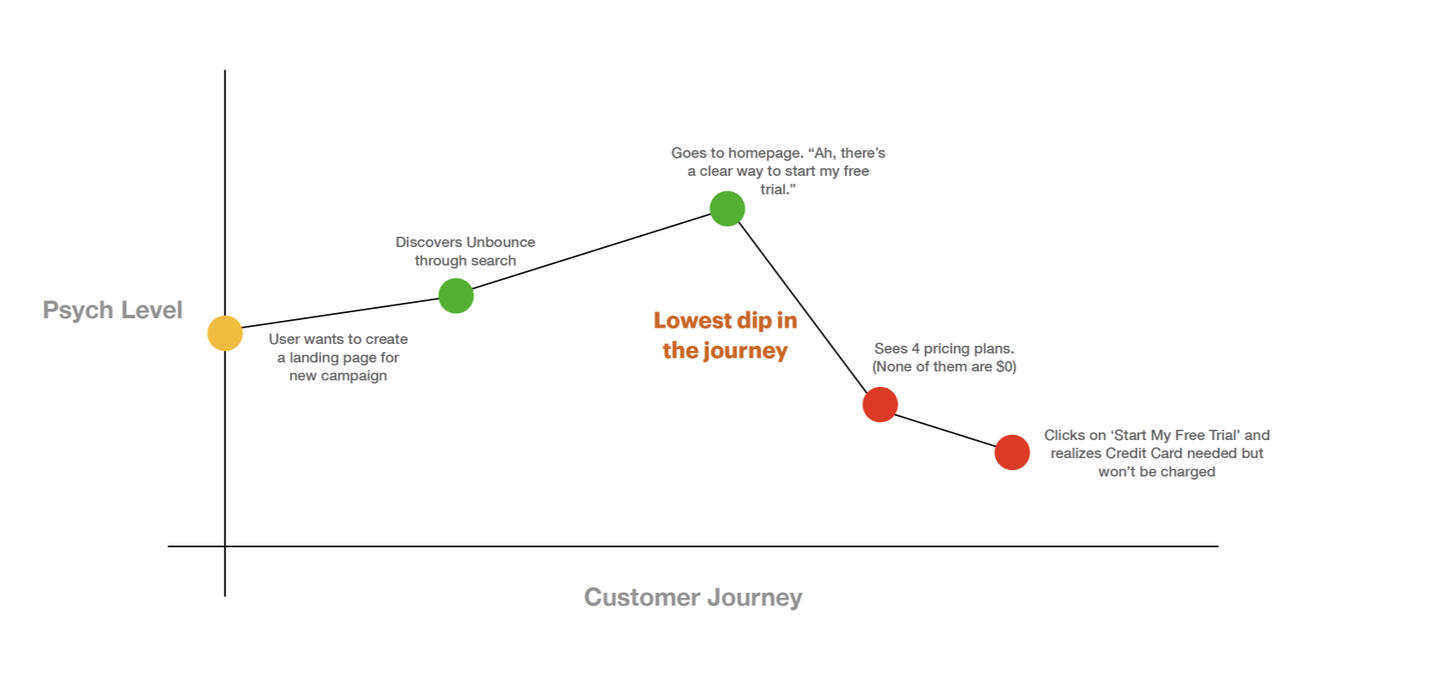
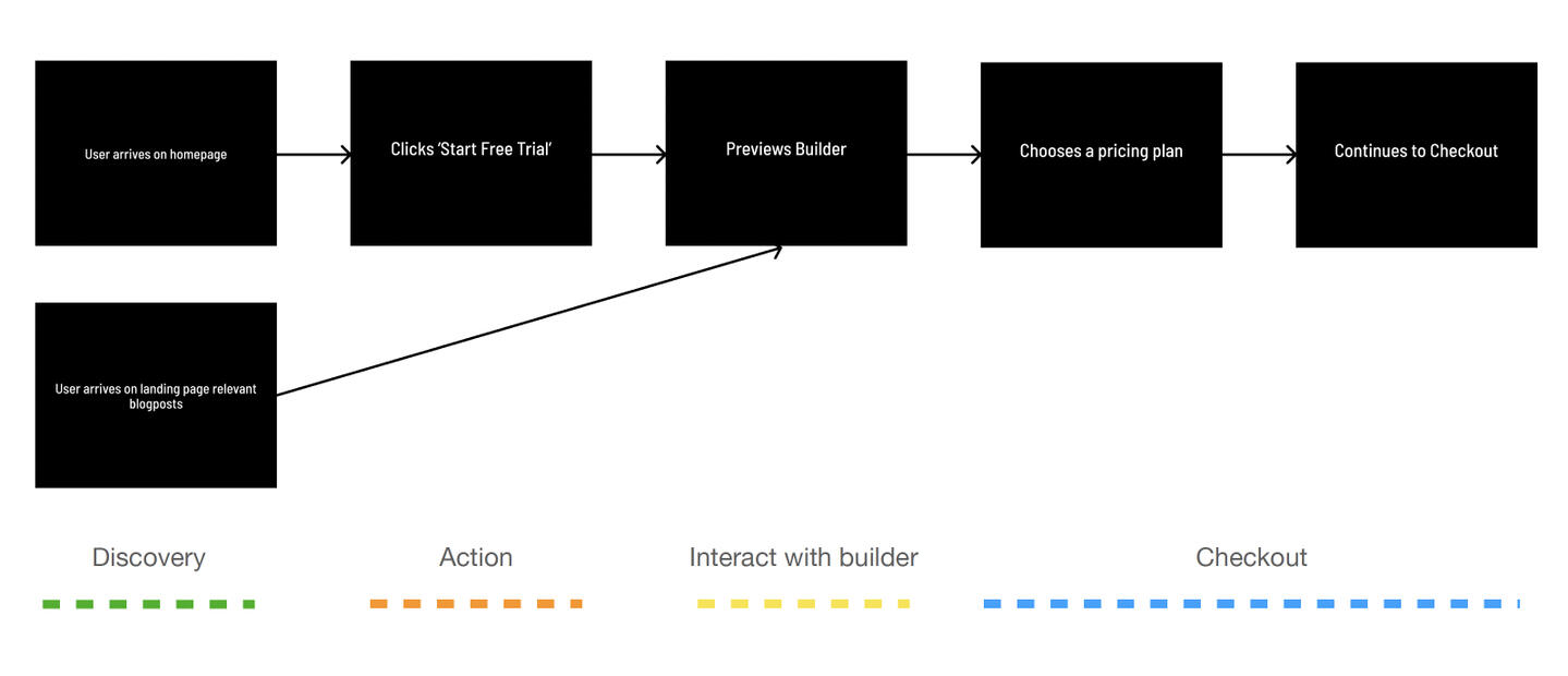
Visualizing the existing user journey
Red's signify frustration or major pain points in user's journey and oranges are 'could be better' moments. The green dots are the ideal moments and ones that we wanted to optimize for.
Empathy Statement
“I want to try the landing page builder’s functionality before I commit to using it.”
Problem Statement
How might we get visitors to perceive value in the builder before they make a long-term commitment?
Hypothesis
Visitors experiencing the builder are more likely to convert to paying customers than those who do not view this experience, and therefore, don’t perceive any value before committing to a long-term plan.
Success Metrics
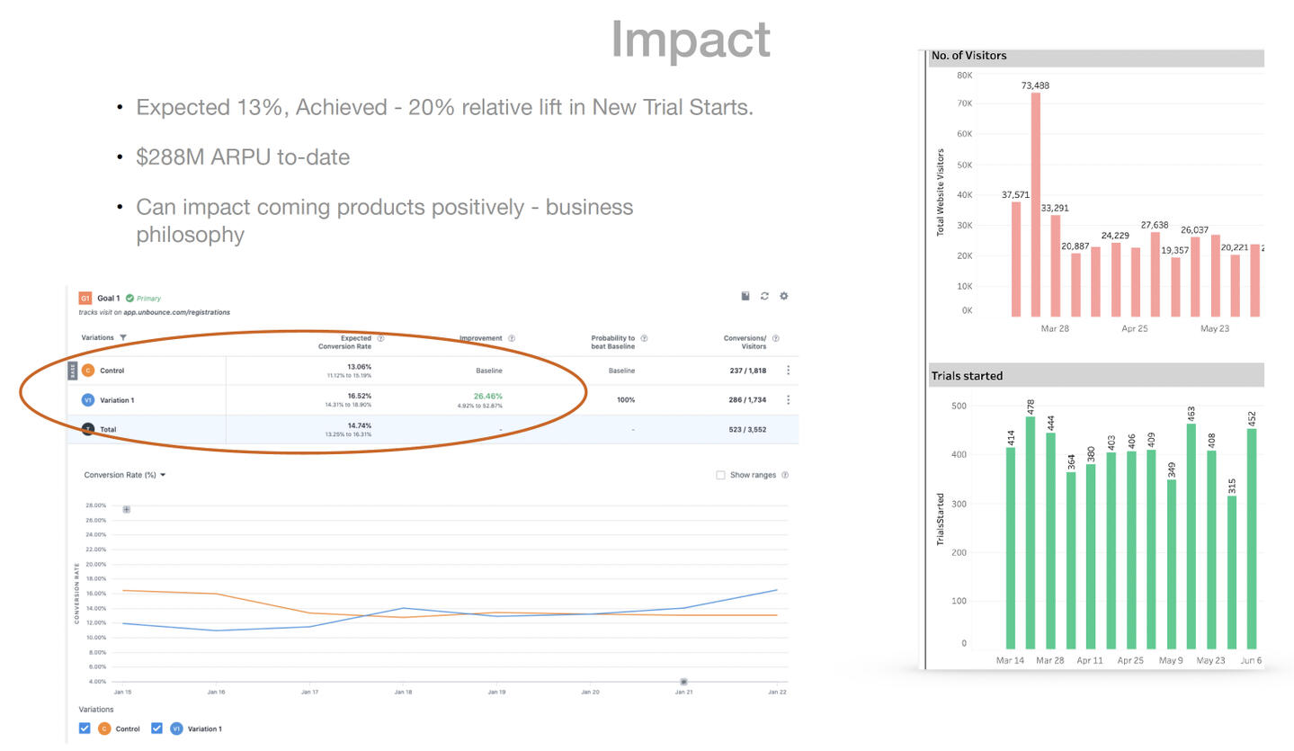
• Primary Metric : 13% relative lift in NTS (New Trial Starts)
• Secondary Metric : Better quality NTS, i.e., visitors becoming longer-term paying customers
• Tertiary Metric : How much faster are users able to make up their minds about picking a pricing plan?
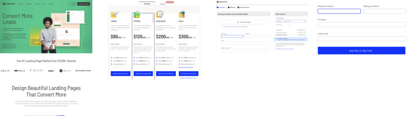
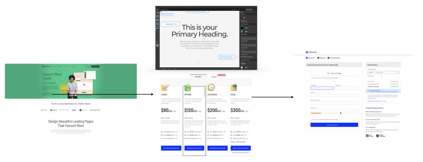
Old user flow (with significant churn)
Explorations
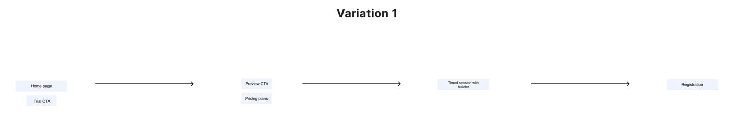
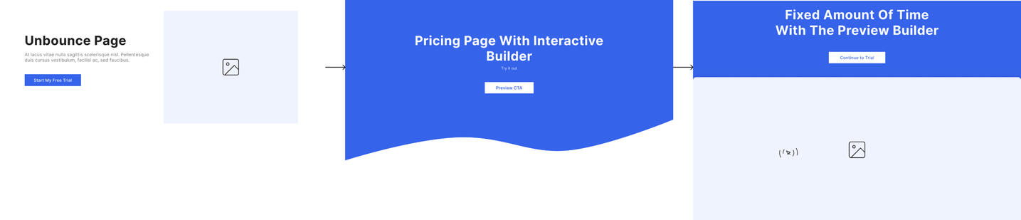
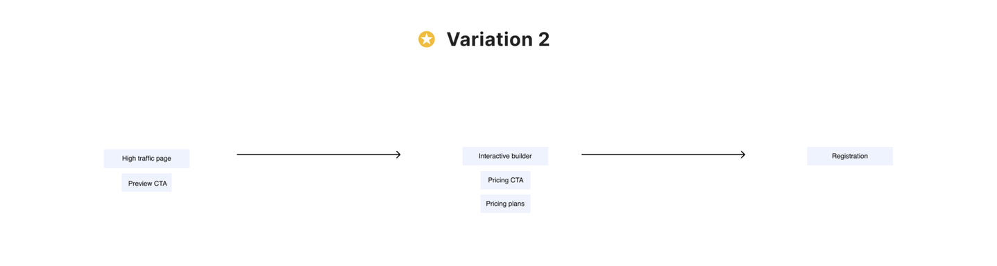

Mid-fidelity solution flow
Upon testing, variation 2, won!1. User lands on an Unbounce landing page which is high-converting.
2. User clicks on CTA to go to the pricing page but instead of the traditional pricing table, we added an image of the builder with an intentionally incomplete looking template that user might want to interact with.
3. We would track clicks on the builder image as signal for people wanting to interact with the builder before making a commitment.
4. User chooses one of the pricing plans and continues to registration,
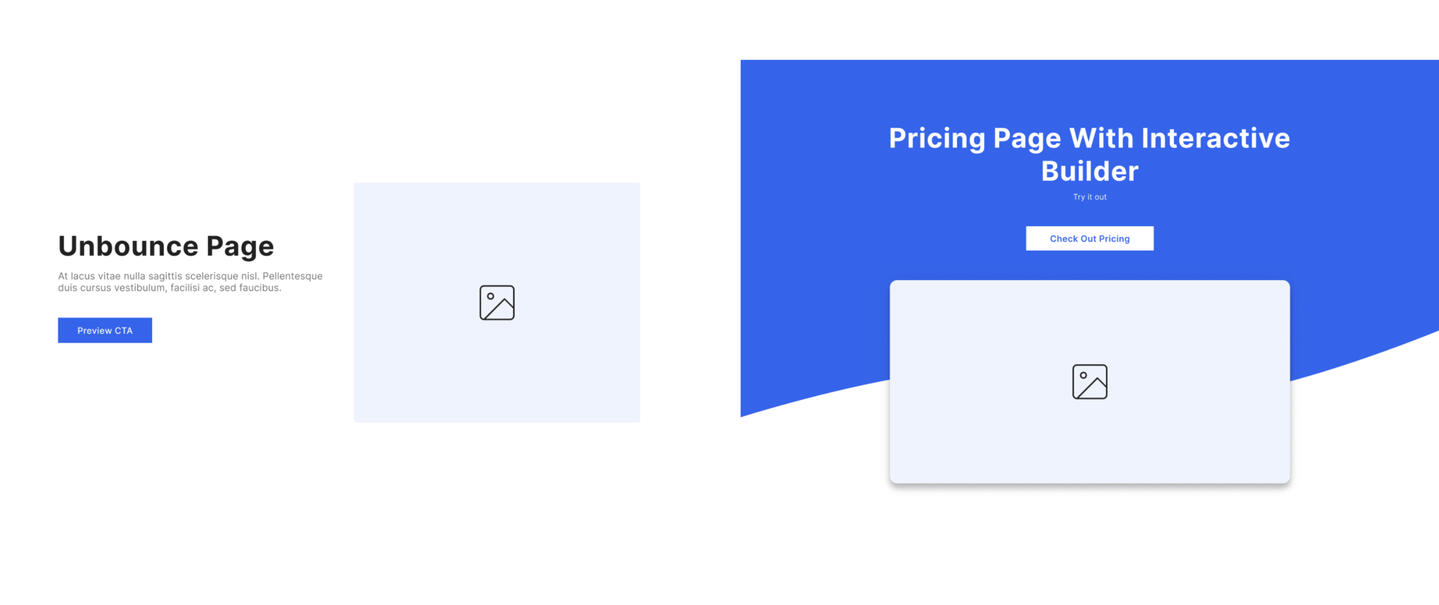
Solution evolution
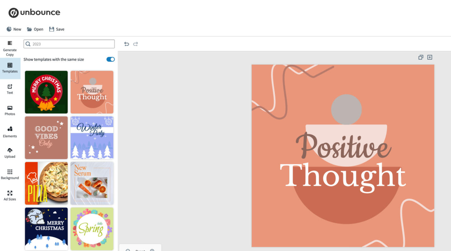
The growth team hacked the builder and added it into an <iframe> on the pricing page, thus allowing users to fully interact with the builder, as if they were already on a plan.
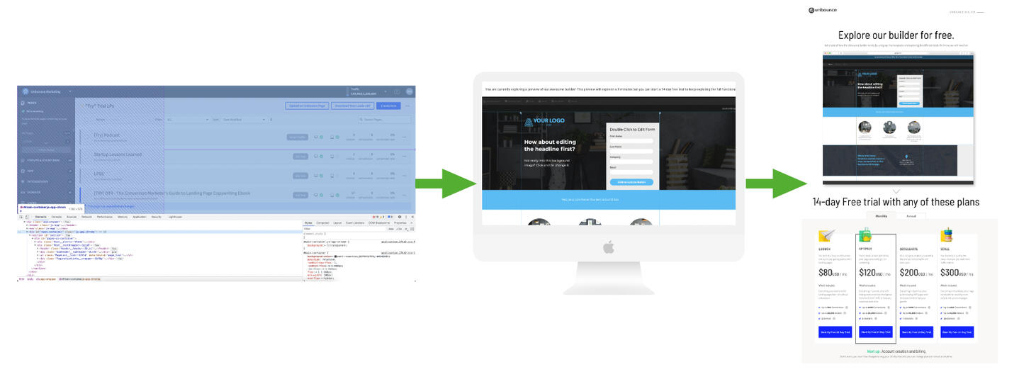
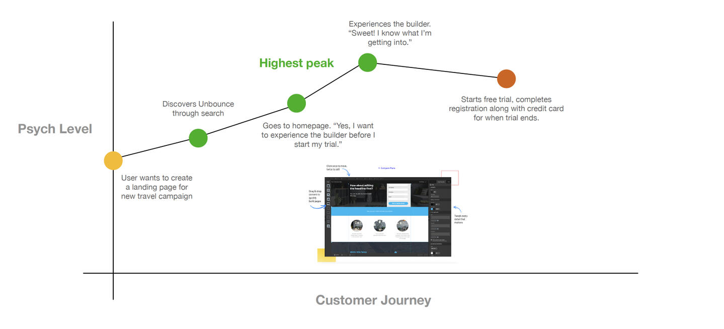
Proposed User Journey
Reviewed the journey with the PM and Engineer to finalize the solution that'd give us the highest success for NTS (New Trial Starts)
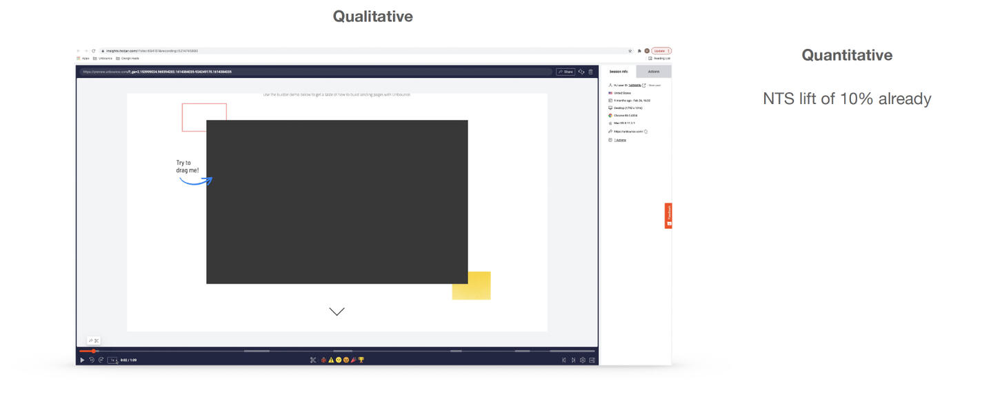
Qualitative and Quantitative Feedback
Having set up Hotjar for recording users' entire journey with our experiment, the team and I watched what was working and what wasn't. In terms of the Quantitative data, we were already seeing a lift of 10% in our NTS (tracked through Google Analytics).Unfortunately, most users were clicking on the text outside of the builder as opposed to inside the builder container. To solve for this, I iterated on the aiding text.
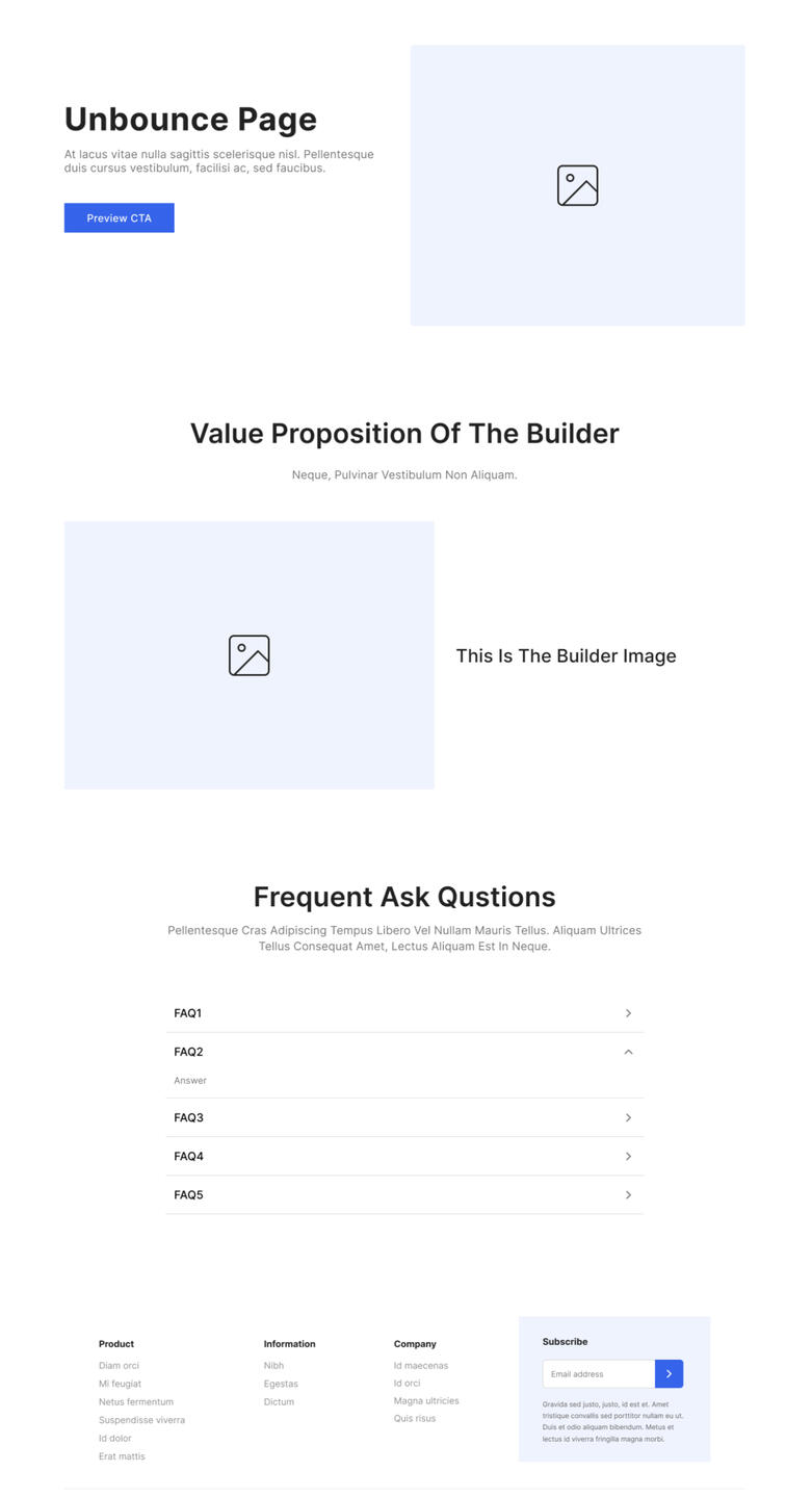
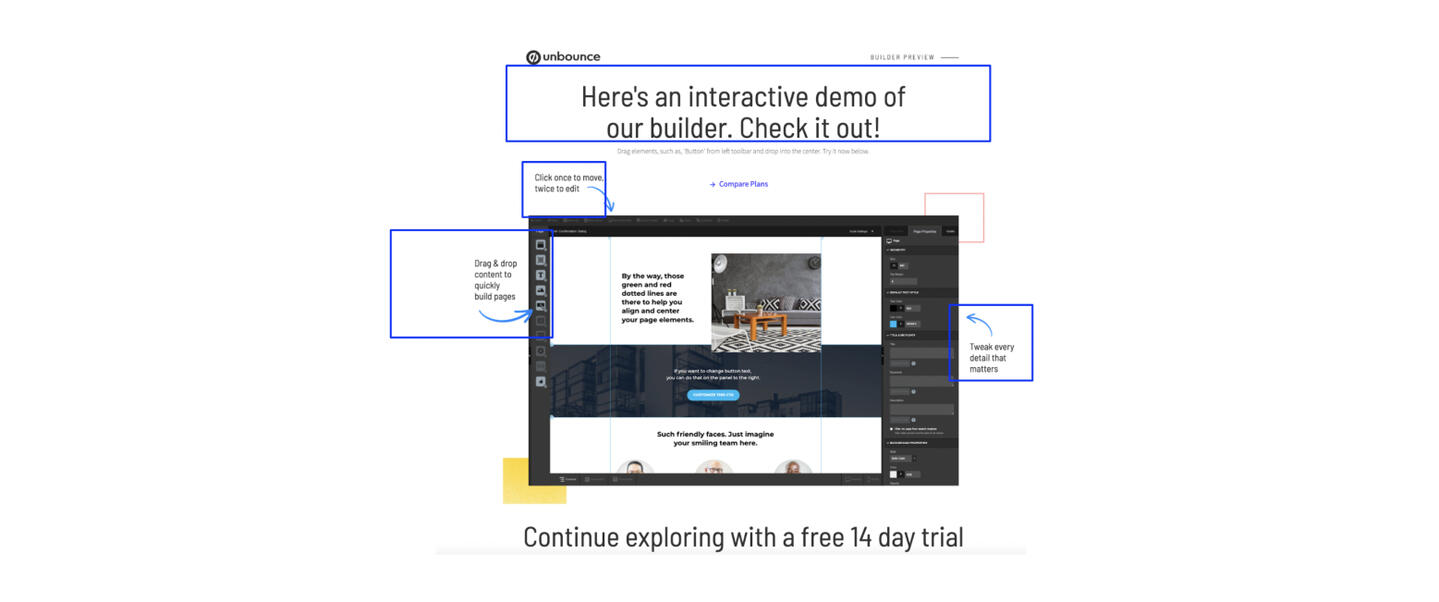
UX writing (Iteration)
I used the current qualitative data at hand and took a stab at some copy variations. The goal was to get users to understand that the builder wasn't just a static image but an interactive component. The test copy is highlighted in blue.
Experiment Success
Impact
Improved Customer Journey